Startup Graveyard is a resource for entrepreneurs to avoid making the same mistakes as failed startups. This is my thesis project for New York University’s Integrated Digital Media program. About 90% of startups fail, but information on their failure gets lost in the web. There was no one place to go for all the data on these companies. In developing the project, I knew that to dispell some of the negative feelings associated with failure I wanted there to be a layer of humor. I collected data from multiple online sources, read through articles revealing perceived reasons for failure.
Research
The first user test involved 48 users, 16 on desktops, 16 on tablets, and 16 on mobile devices. Of the 48 participants, 91% would use the website if they were to start their own company. 98% agreed that the website was easy to use and 70% agreed that the iconography used on the website was funny. As far as the overall rating for the site, 29% rated it 5 stars, 44% rated it 4 stars, 19% rated it 3 stars, and 8% rated it 1 star. Of the users that rated the overall website 3 or less stars, the most common comments were that they wanted more information regarding reasons for failure, information about the company or business plans. Of the 48 participants, 47 did not know of websites similar to this one. The one participant that did referenced CBInsight’s Post-Mortem site and preferred the graveyard.
In response to user testing, the goal of the project shifted from showing as many companies as possible to showcasing less companies but providing additional details through clear communication regarding the reasons for failure to create a more satisfying user experience. Additionally, many users tried to click on the reasons for failure, which were not hyperlinked. This revealed an opportunity to link these icons to other companies that displayed the same icons through meta tags.
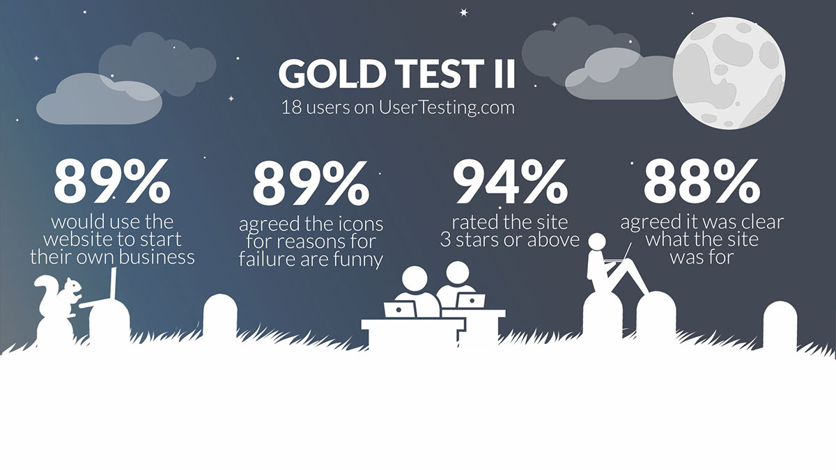
The second user test involved 18 users, 6 tests for desktop, 6 for tablet and 6 for mobile devices. The same tasks were given and metrics were collected. To narrow into the target users for Startup Graveyard, participants were required to agree to one of the following statements:
- I have tried to start a company in the past
- I want to start a company in the future
- I have successfully started my own company
Of the 16 participants, 88% agreed they would use the website if they were to start their own company. All participants agreed that the website was easy to use and 88% agreed that the iconography used on the website was funny. As for the overall rating for the site, 33% rated it 5 stars, 44% rated it 4 stars, 17% rated it 3 stars, and 6% rated it 1 star. Of the 18 participants, 17 did not know of websites similar to this one. The one participant that did referenced TechCrunch’s Deadpool site and preferred the graveyard.
Future Iterations
With future iterations, I would like to explore visualizing aggregated data, create a tool that enables you to compare reasons for failure across companies and sectors, motion graphic animations and creating data stories out of larger companies that acquire startups.


